Effect of Number of IMDb Votes on IMDb Rating
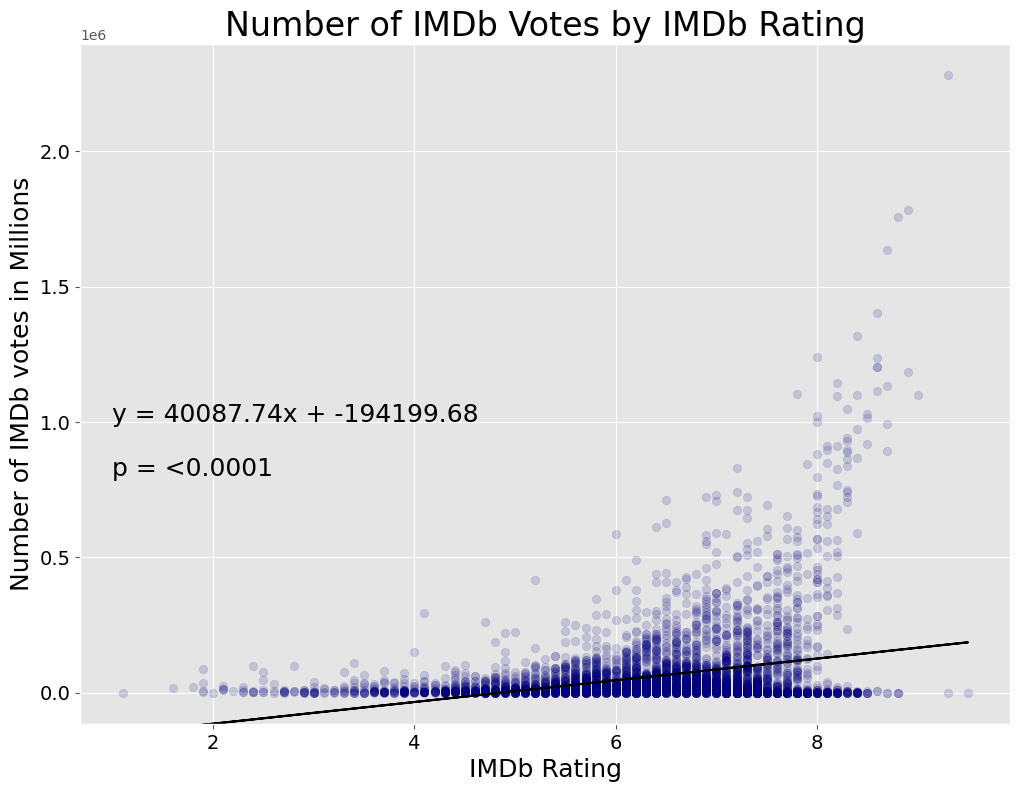
My next hypothesis was to test whether or not people were more likely to rate a good or bad movie. Here I predicted a U shaped curve where people would be more likely to rate a movie if they loved or hated it, I was surprised to see that the curve only went one way.
A Regression analysis resulting in a P value < 0.0001 showed that this relationship is significant. Given more time I would have fitted a curve, though with the plot as bottom-heavy as it is I'm sure it would be disappointing and wouldnt trace the beautiful curve forming the near perfect upper-edge of the cloud.
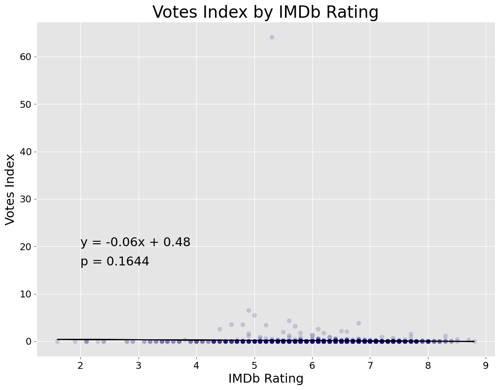
A thought dawned upon me that perhaps the observed relationship was simply that more people had seen movies which were higher rated. As a quick way to test for this I created a 'Votes Index' by dividing the number of votes by the Box Office. As you can see by this next graph, most of the time this index is around the order of magnitude of 0.1, but a few unfortunate movies pulled in tens of votes per dollar made, which skewed the range of this graph and crowded the cloud to the bottom.
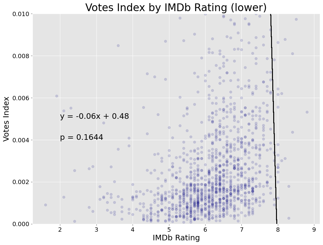
This graph has tweaked limits to show where the majority of the points actually are, and while it visualy looks like there might be some positive regression, the statistics tell a different story, with an insignificant P Value and a negative regression line crashing into 0 at around an IMDb rating of 8.